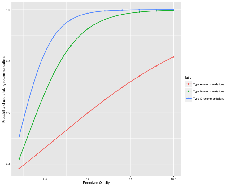
When we have the coefficients of a logistic regression model, we need to somehow compute the probabilities at different points based on the log odd likelihood. This process sometime takes time. I wrote codes for my research project to plot out the probabilistic curve as follow.
Codes
library(boot)
library(ggplot2)

generateDF <- function(coeff1, coeff2, label) {
  seqs = seq(from=1, to=10, length=10)*1
  probability = inv.logit(coeff1 + coeff2*seqs)

  mydf <- data.frame(seqs = seqs, probability = probability)
  mydf$label = label
  return(mydf)
}

mydf0 <- generateDF(-0.6931, 0.2187, "Type A recommendations")
mydf1 <- generateDF(-1.0296, 0.7087, "Type B recommendations")
mydf2 <- generateDF(-1.0116, 1.0480, "Type C recommendations")
mydf <- rbind(mydf0, mydf1, mydf2)

ggplot(mydf, aes(x=seqs, y=probability, colour = label)) +
  geom_point() +
  stat_smooth( method="glm", method.args=list(family="binomial"), se=F) +
  xlab("Perceived Quality") +
  ylab("Probability of users taking recommendations")
The code above produces the following plot.